They arrived with a name. Everything else was still to build.
Overview
What we did
Brand Strategy
Brand Platform
Visual Identity
Verbal Identity
Web Design
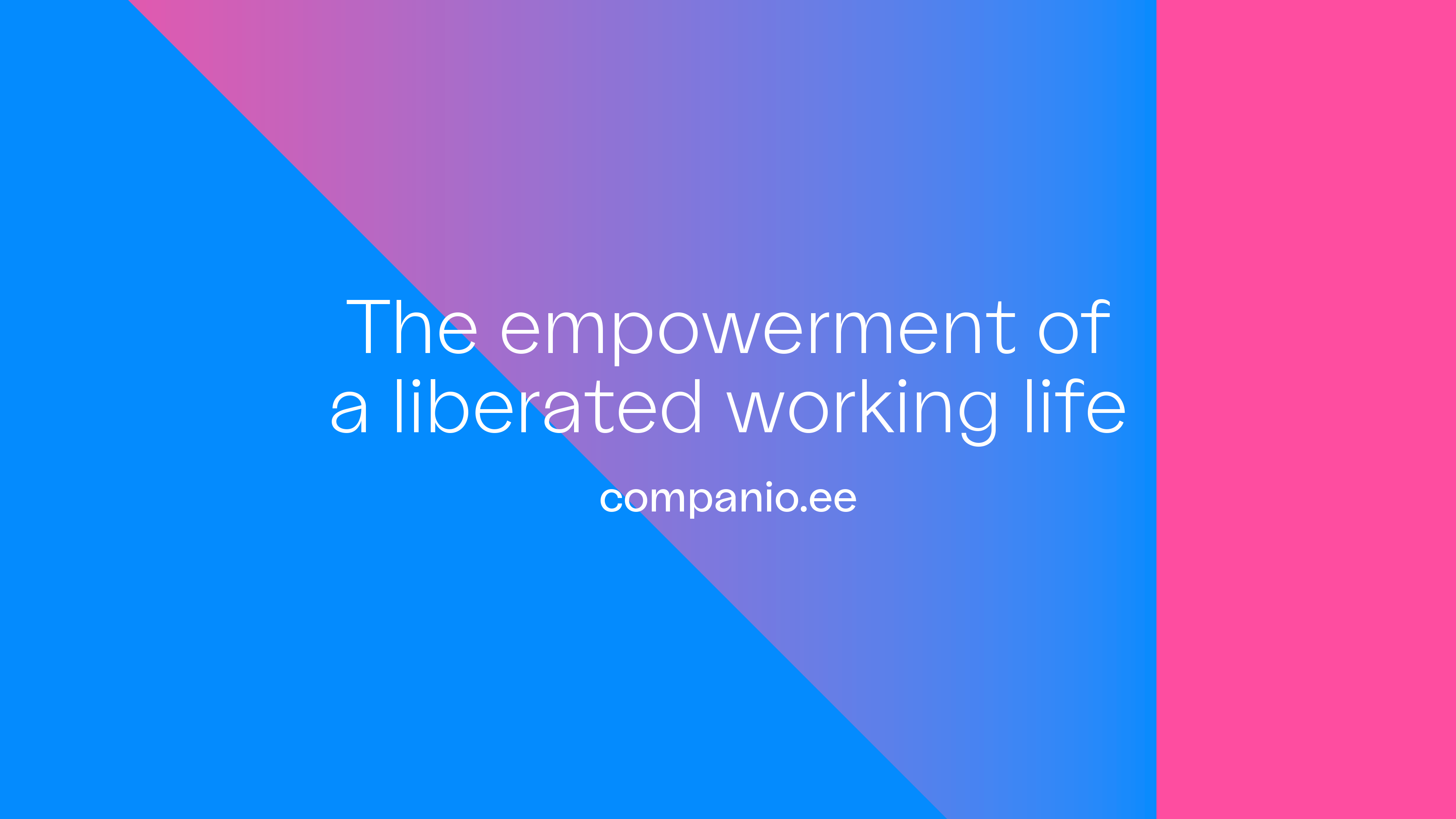
Companio started life in 2018 as ‘Your Company in Estonia’, and grew quickly into the leading foreign-owned connector to Estonia’s e-Residency scheme. By 2021 the ambition had outgrown the name: not a route into one country’s scheme, but business and accounting services for borderless companies anywhere.
Founders Ignacio and Miguel had chosen the new name. That was all they had. No platform, no identity, no voice, no site.
We ran the full Launch programme with them – brand platform workshops through to a web interface they could build themselves.
A new name, taken to a working brand and a live product surface.

Position
The workshops had one job: find out what Companio was actually for, beyond the service it sold.
What surfaced was bigger than accounting. Companio exists as a vehicle for reimagining what it is to be an independent, sovereign person in the twenty-first century – disrupting how businesses are structured and putting a liberated working life within more people’s reach. They share resources, experiences, connections and knowledge with their clients, not just filings and returns.
We landed the platform on sharing freedom. It is a genuinely uncomfortable idea for an accountancy business, which is exactly why it was right. Nobody else in the category could say it and be believed.
System
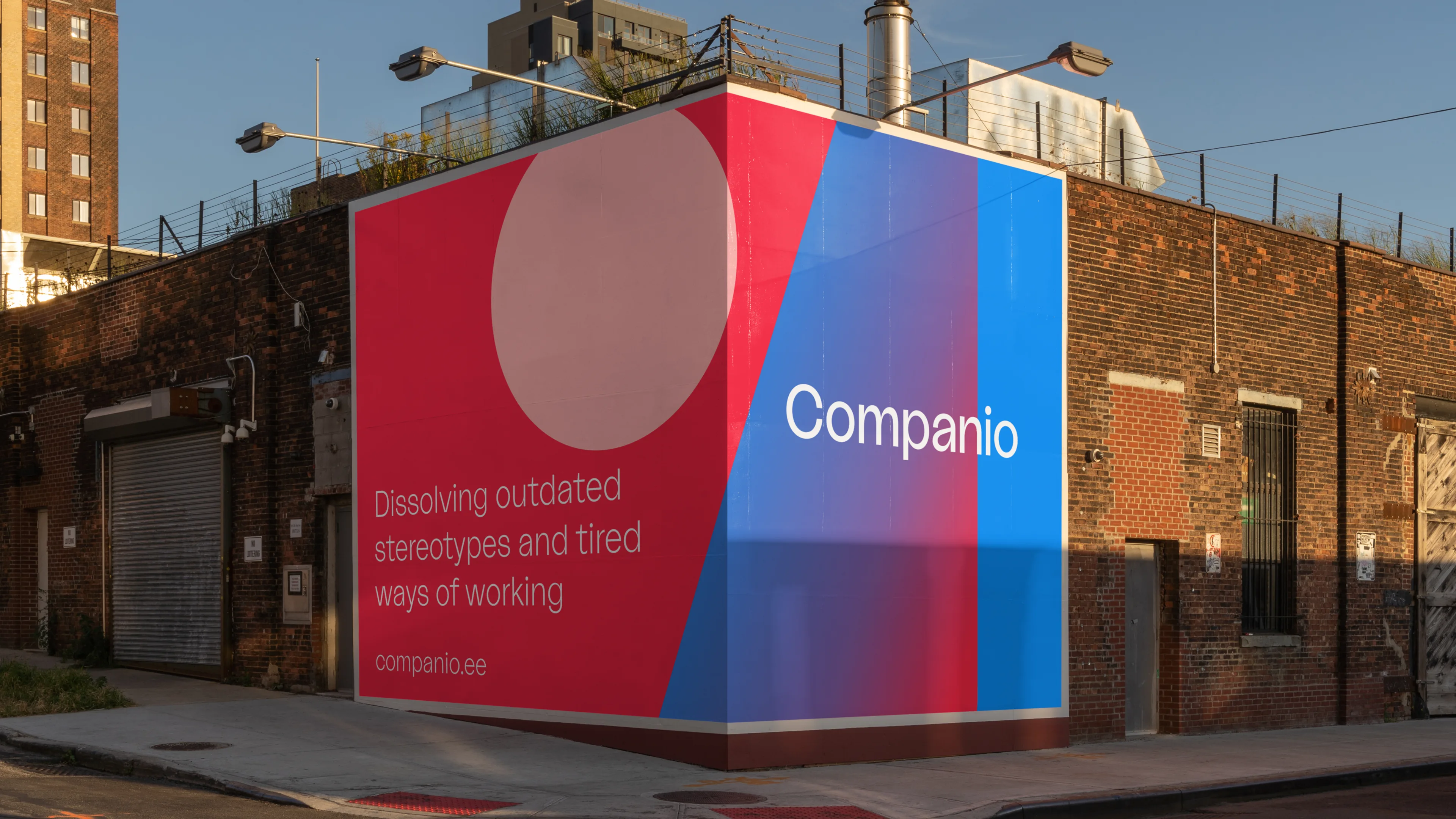
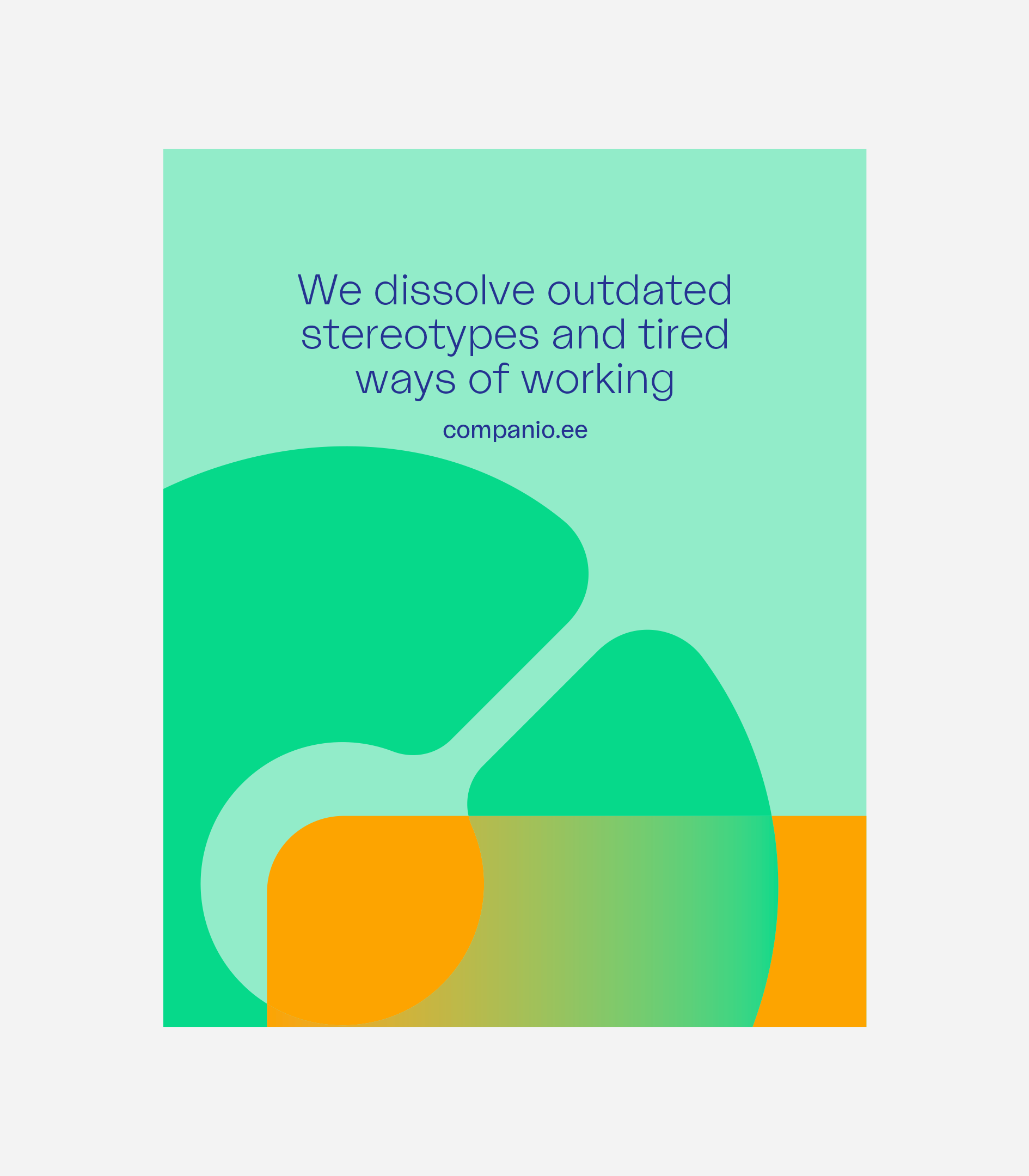
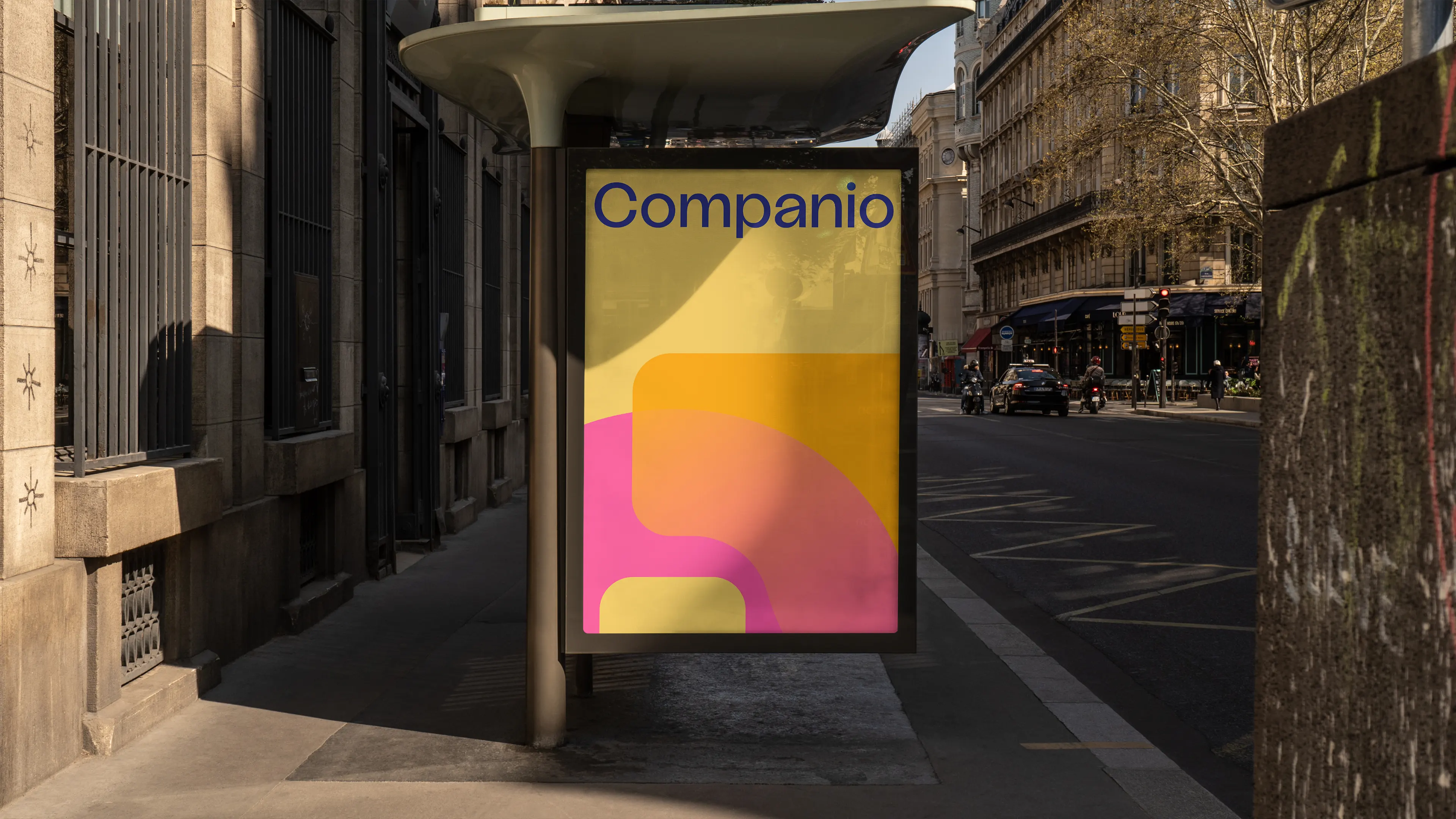
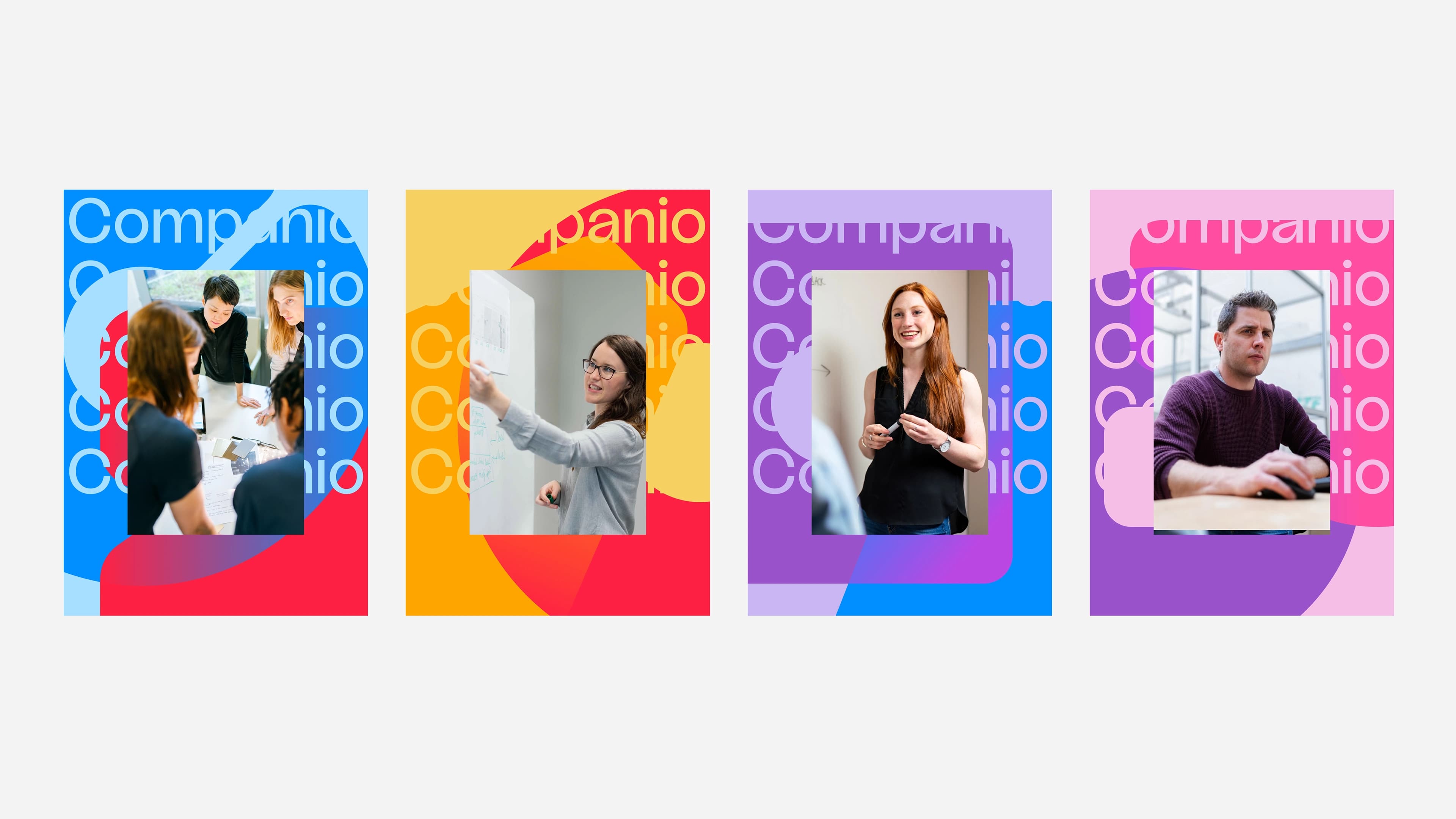
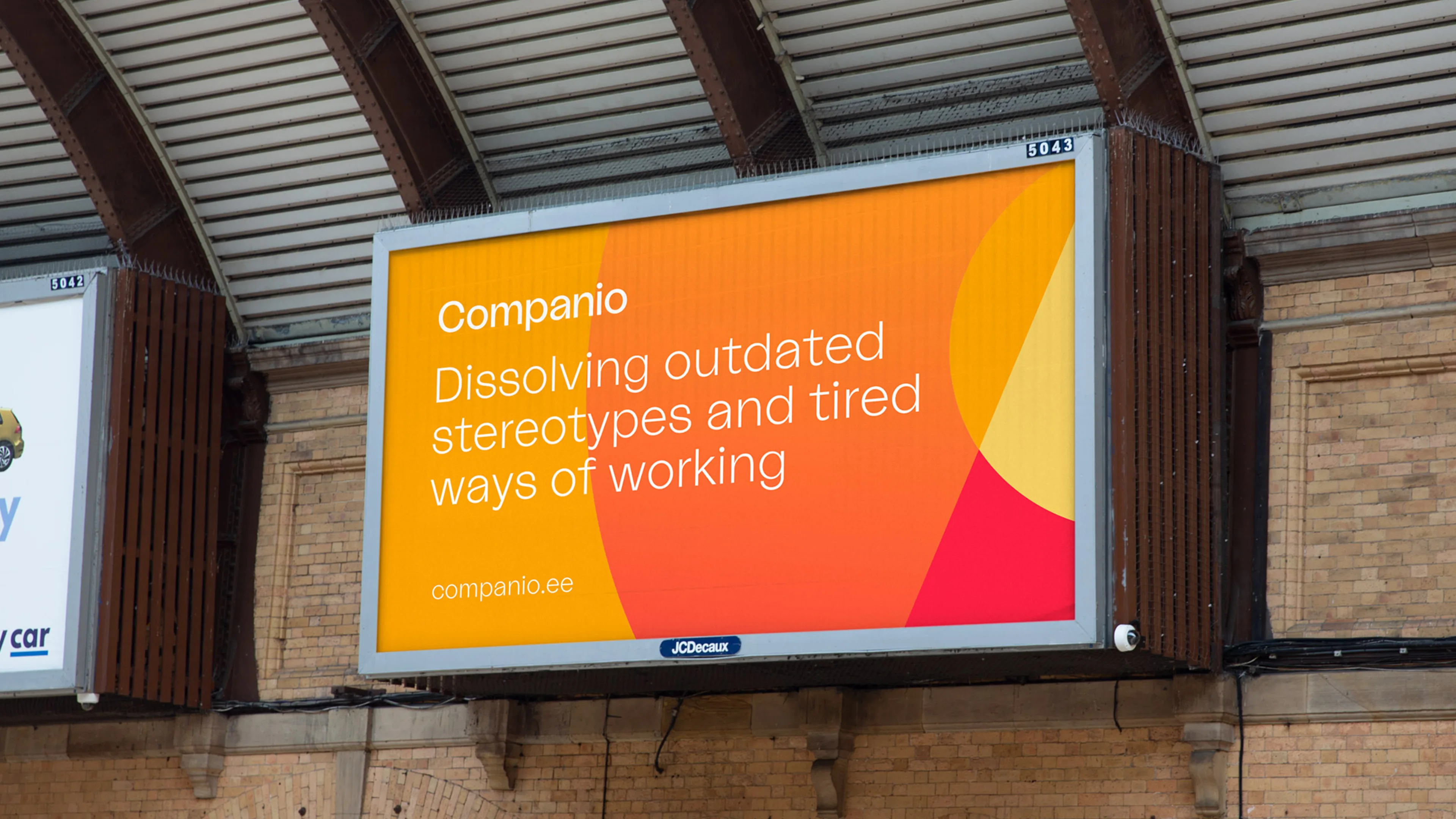
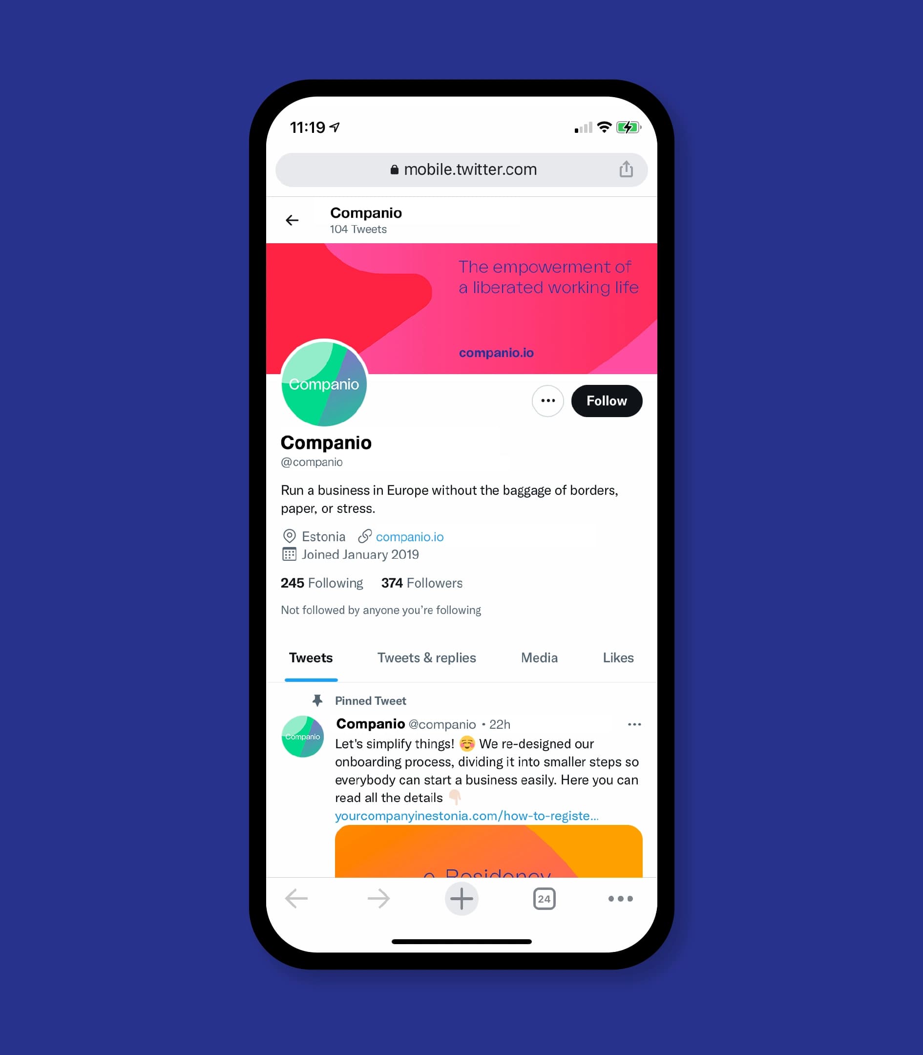
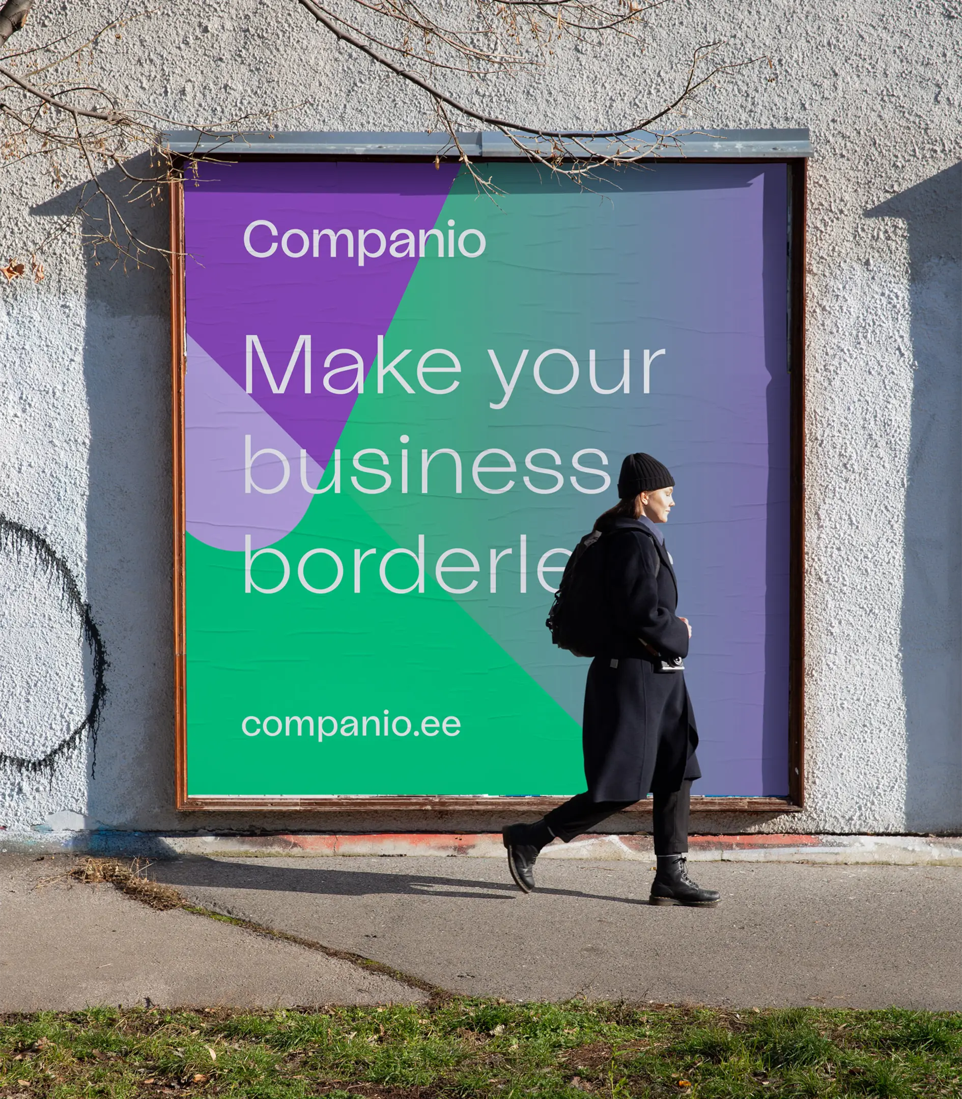
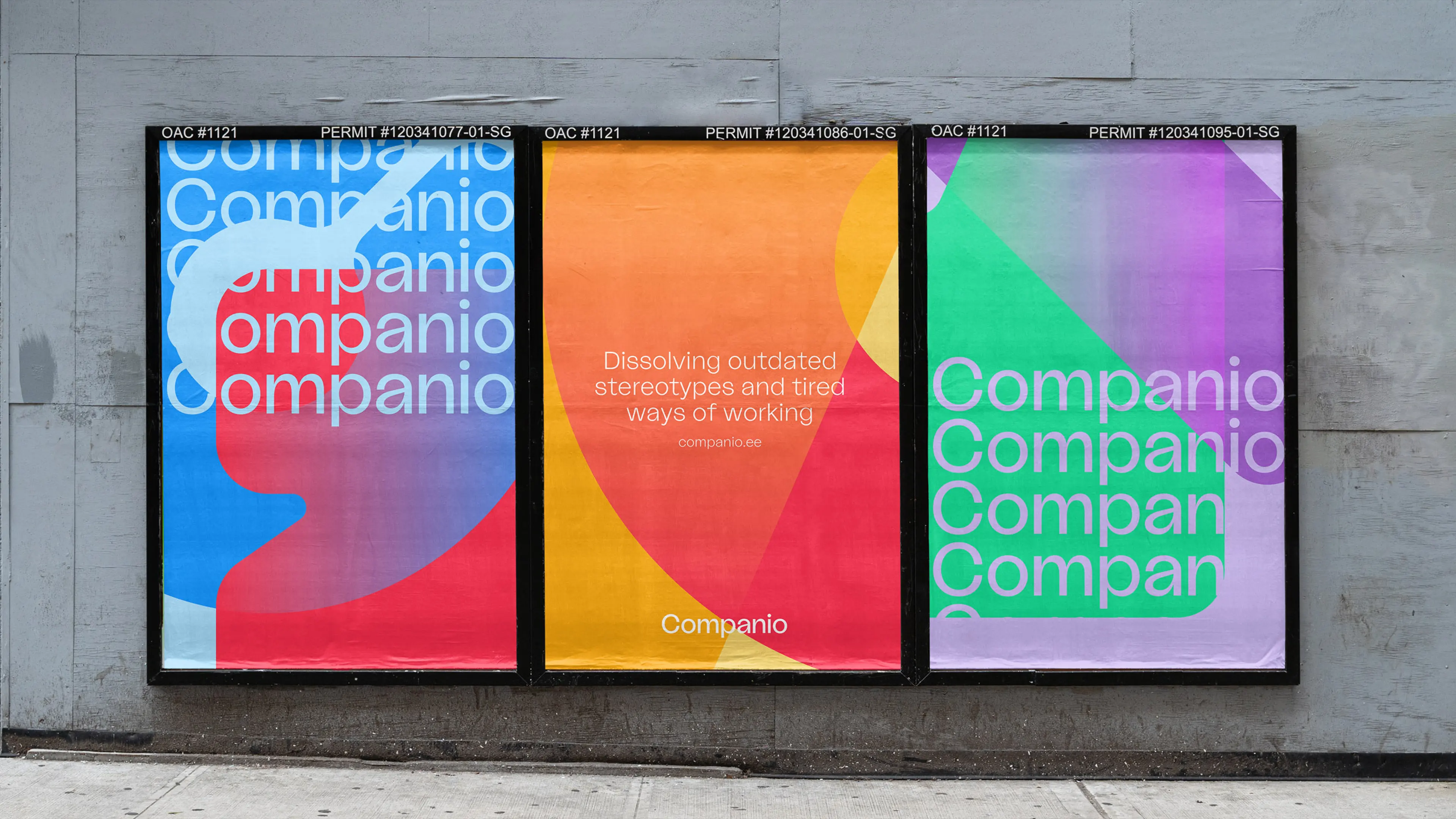
The visual language is fluid, adaptive and never quite the same twice.
Abstracted shapes and a vibrant palette allow close to infinite compositions, so the identity moves the way the business does. Companio’s solutions are not one-size-fits-all – they are constantly pushing at the boundaries of how a modern company can be structured – and a rigid system would have contradicted the proposition on sight.
The verbal identity carried the same logic: plain, warm and unbureaucratic, in a category that defaults to the opposite.

Trust in change
Then the counterweight, which is where the work got difficult.
Companio innovates in a conservative field. Registering a business, handling tax, managing accounts – none of it can be taken lightly. Their clients already think outside the status quo, but professionalism, knowledge and transparency still had to be unmistakable, or the freedom argument reads as recklessness.
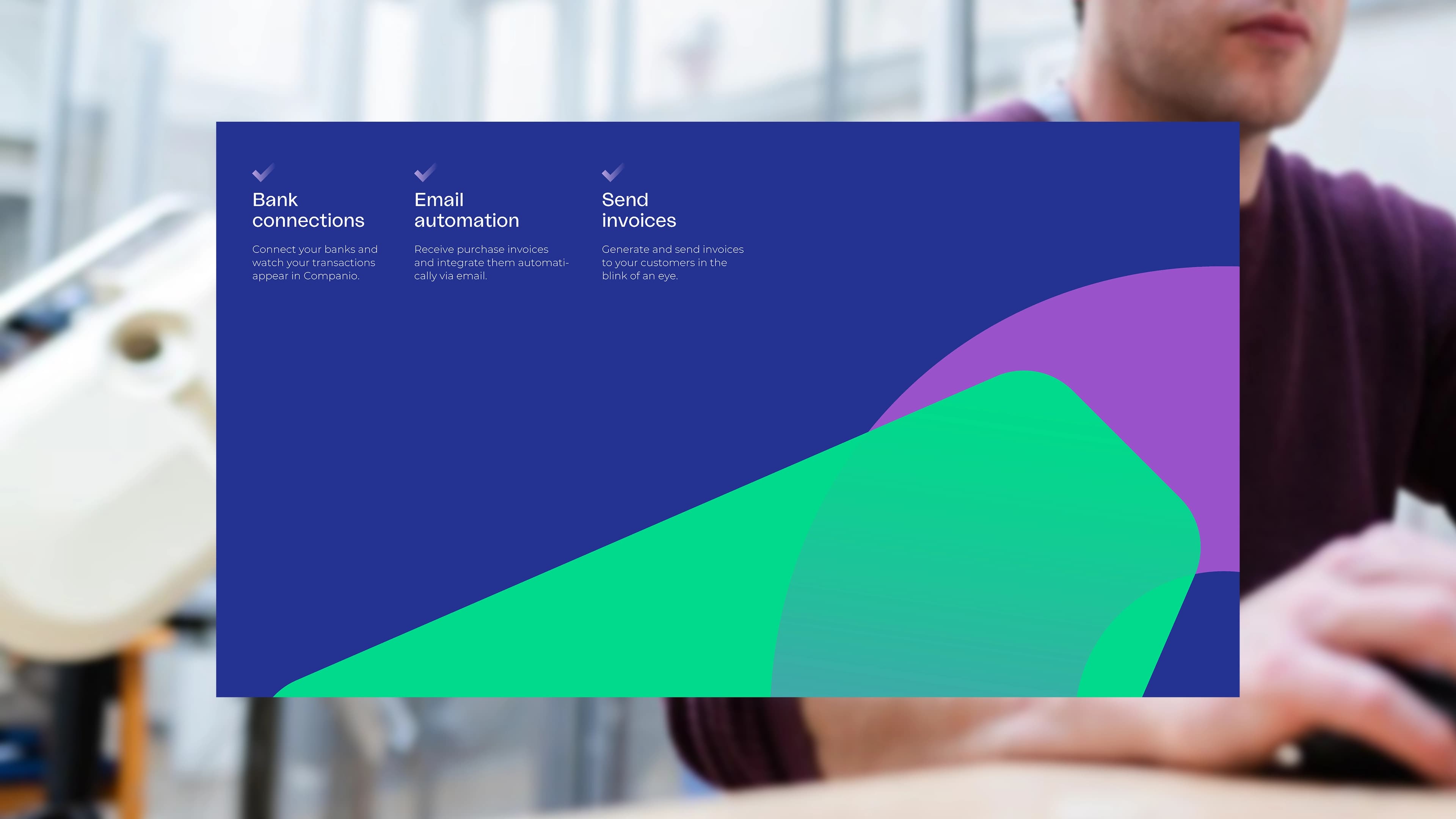
Colour and typography do that work around the bolder elements. The system is disciplined precisely where it needs to be trusted, and loose everywhere else.
Interface
Both founders are developers, which changed the shape of the final phase.
Rather than building the site ourselves, we designed the web interface for them to build – handing over a resolved design that fitted how they already worked, and leaving the implementation where the capability already sat.
“Airborne took us from ‘meh’ to ‘wow’. What really stood out was how they involved us in every relevant step in the process. It felt like they understood what we needed better than we did!”
– Ignacio Nieto Carvajal, CEO, Companio
Why this matters
Trust and disruption pull in opposite directions, and most brands in regulated categories resolve the tension by surrendering to one of them.
The job here was holding both: radical enough to sell freedom, disciplined enough to be trusted with your accounts. That balance is not a visual decision. It is a structural one, and it has to be made in the platform before a single colour is chosen.
More
FTA
The UAE talent agency branded from conception and live in eight weeks – six-figure revenue in year one, and Diamond at the Transform Awards.
Oxley
An approvals tool for senior finance professionals, built and incubated by Blue Rocket – brand and product, live and still running.
Mission Street Ventures
An on-chain venture fund from the team behind Ankr, backing web3 and crypto – an anti-brand built to still work.