
They asked for an anti-brand. We built one that still had to work.
Overview
What we did
Brand Platform
Visual Identity
Verbal Identity
Web Design
Web Build
Copywriting
Mission Street Ventures was founded by the team behind Ankr to back innovative web3 and crypto ventures. Not a conventional fund with a crypto allocation – a fund built on-chain, operating outside the status quo of venture by design, and unapologetic about it.
The brief was unusual and unusually clear. They did not want to look like a fund. They did not want the reassurance architecture that venture brands reach for by default. They asked for an anti-brand.
Anti-brand is easy to say and difficult to deliver, because the moment restraint stops being deliberate it just reads as unfinished.
A logo with no fixed form. A website you had to type your way into.
Position
Hesitation is the enemy of progress.
MSV moved and executed, and had no interest in explaining themselves while they did it. There is a deliberate opacity around the organisation – a mystique they were entirely comfortable with. They take different forms for different engagements. They are engineers. They build.
The strategic problem was that a fund still has to be found. Founders need to know who to approach, and portfolio companies need somewhere to point. So the work could not simply be absence. It had to be an identity that withheld on purpose and made the withholding legible as confidence rather than as neglect.
We built the brand around exactly that: bold, challenging, and a little elusive.
System
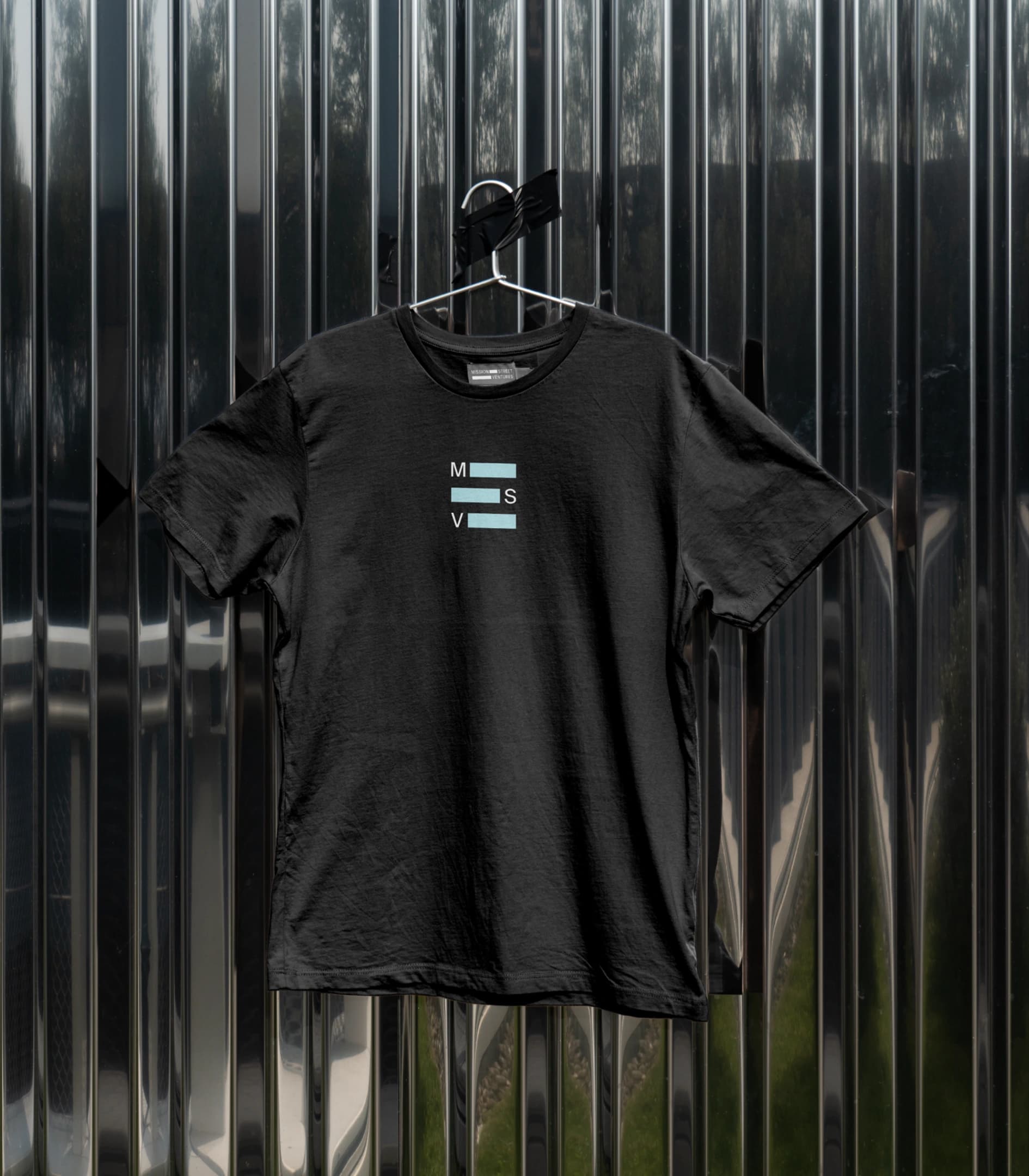
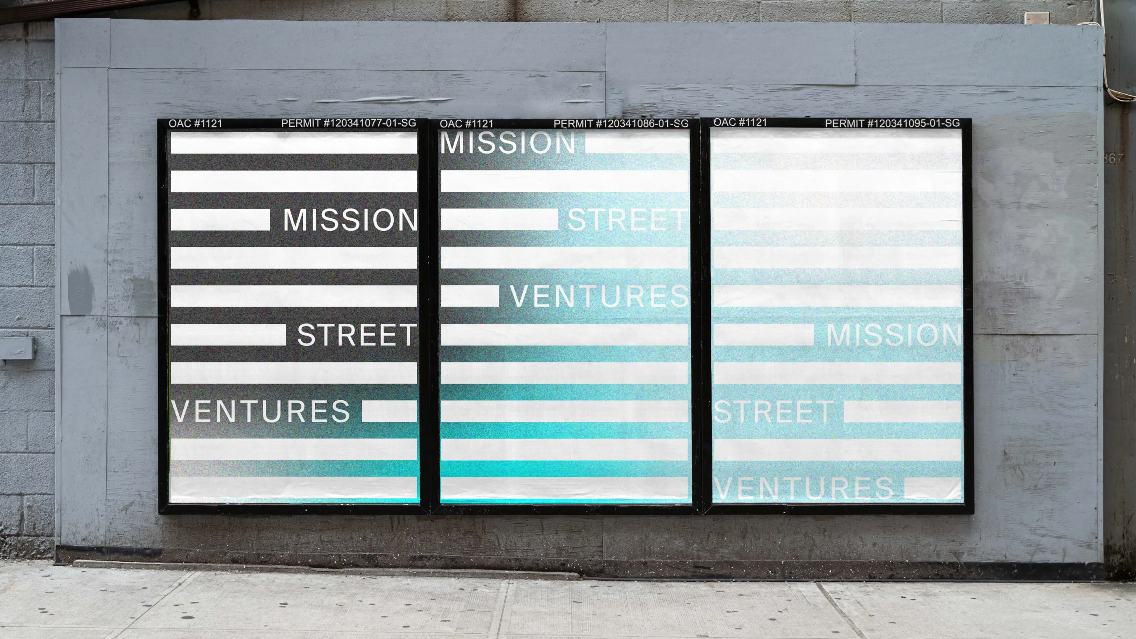
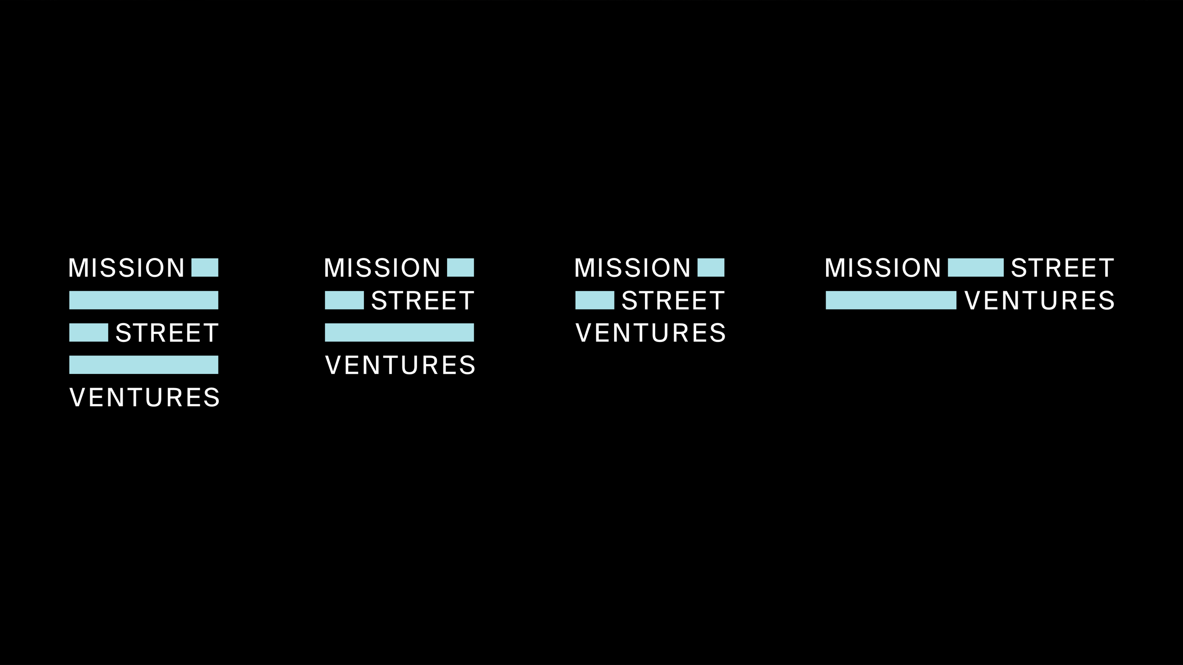
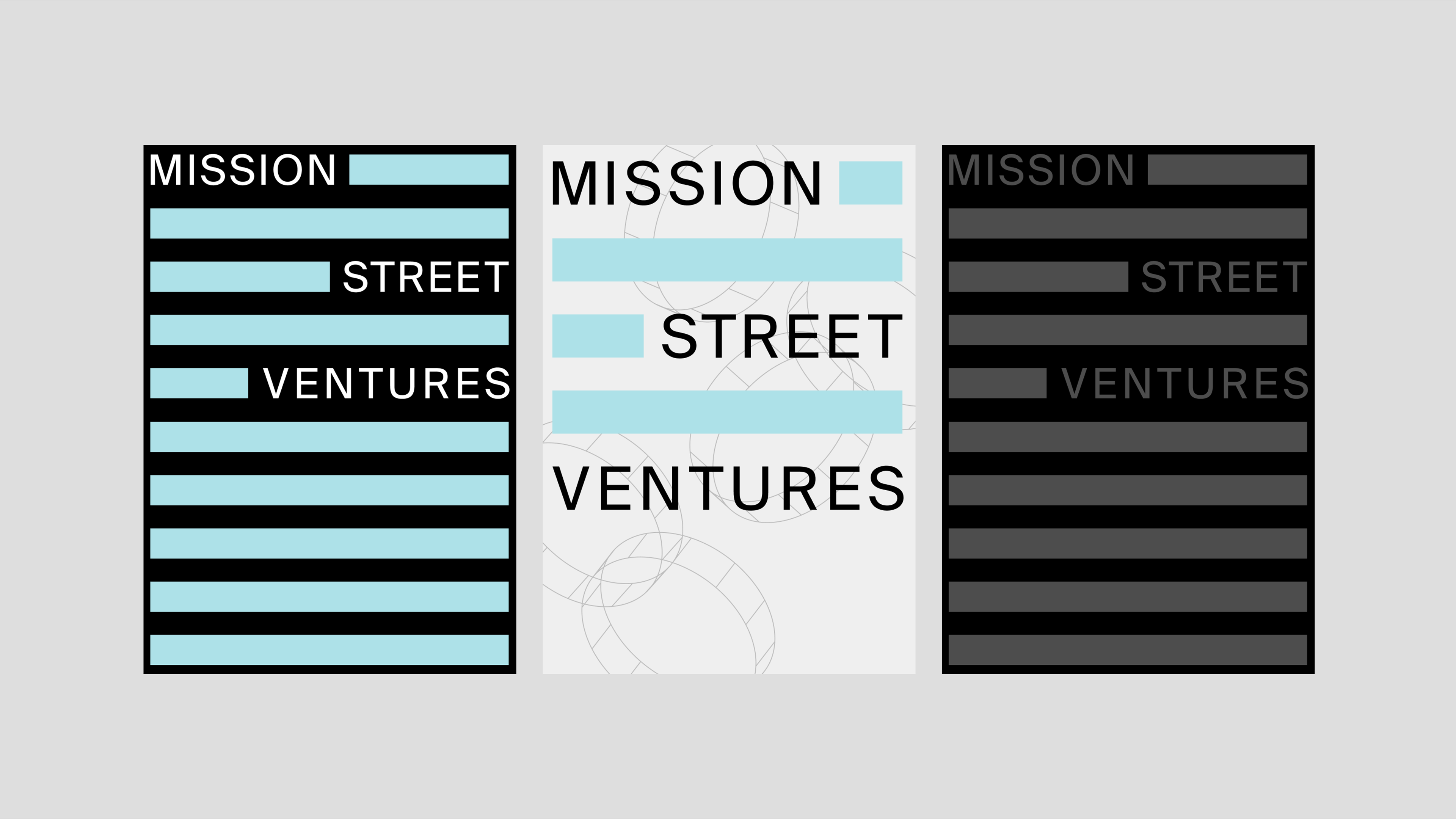
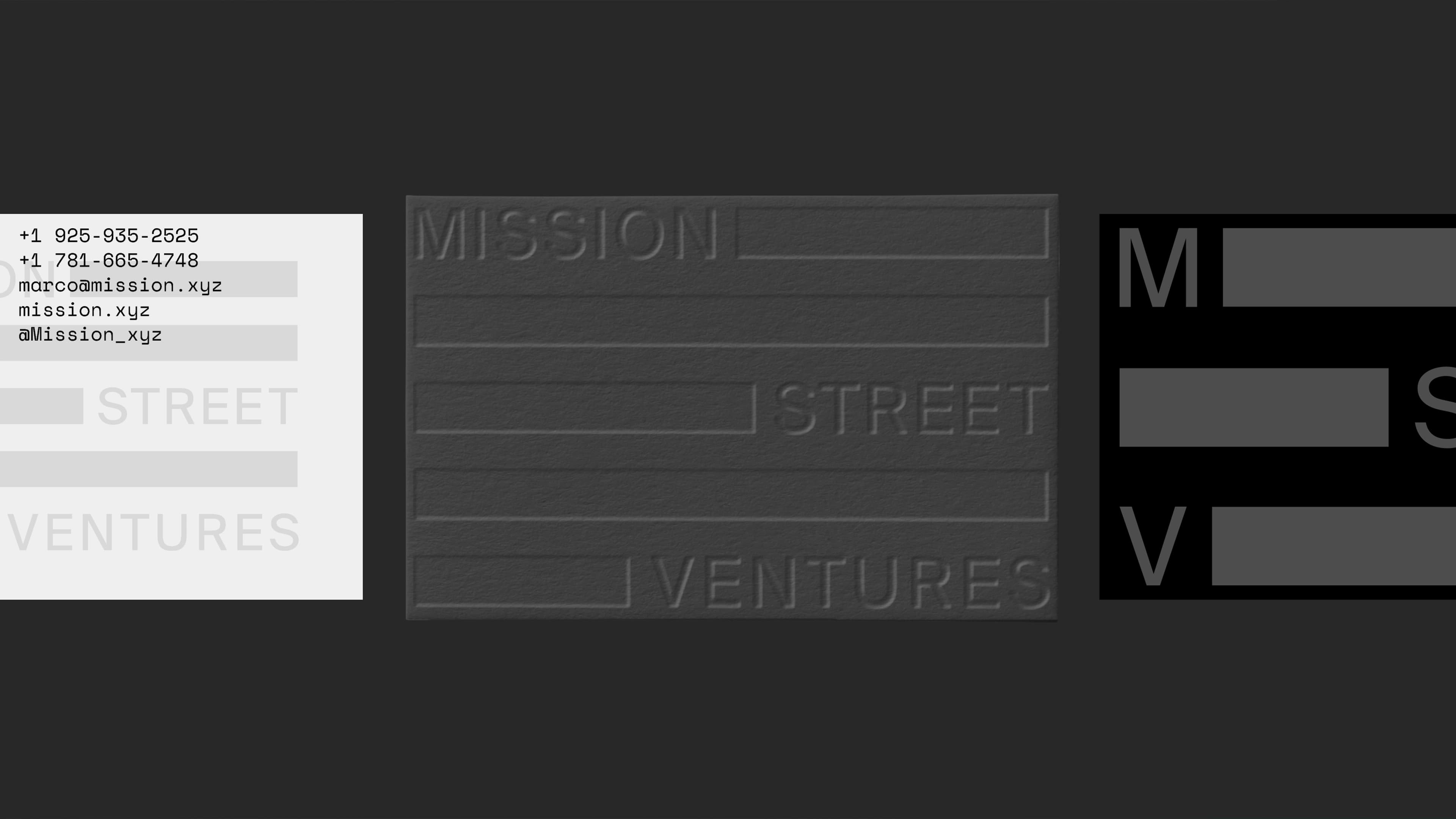
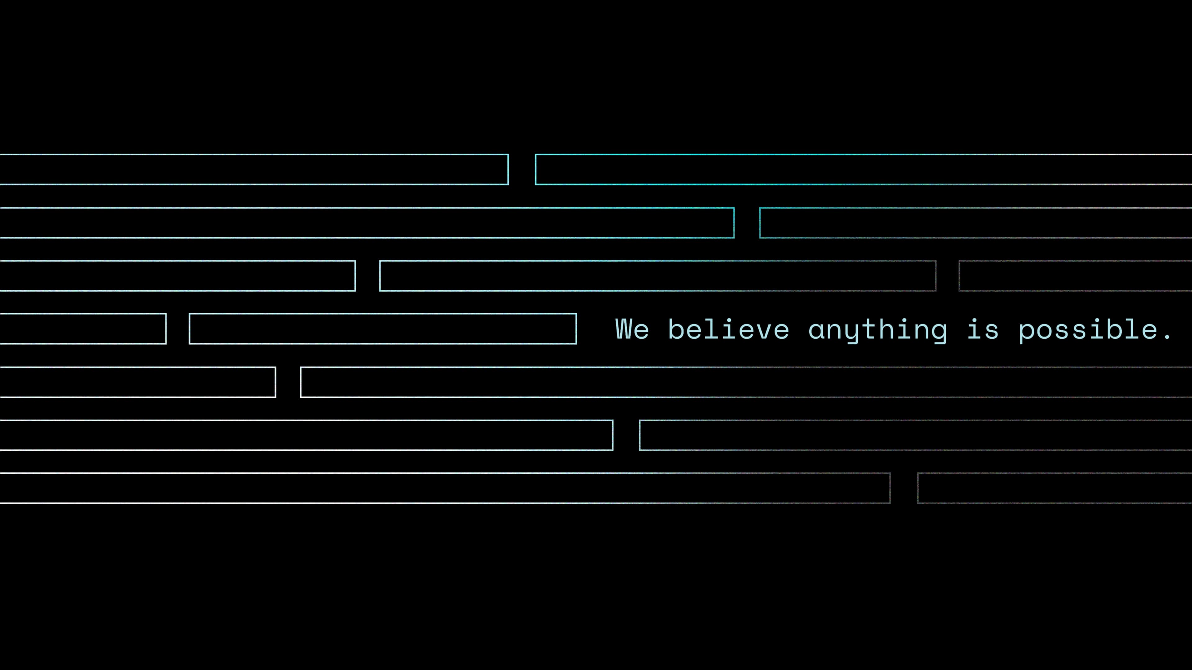
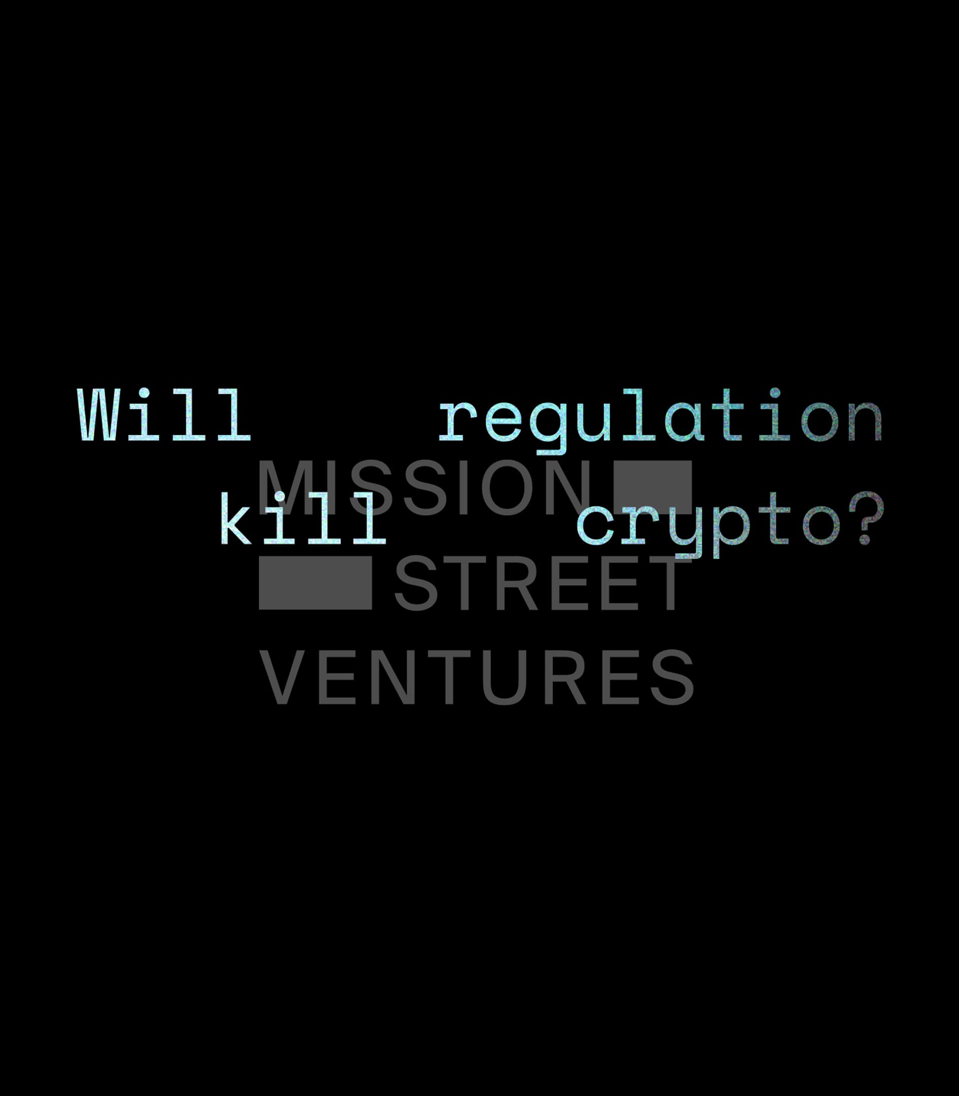
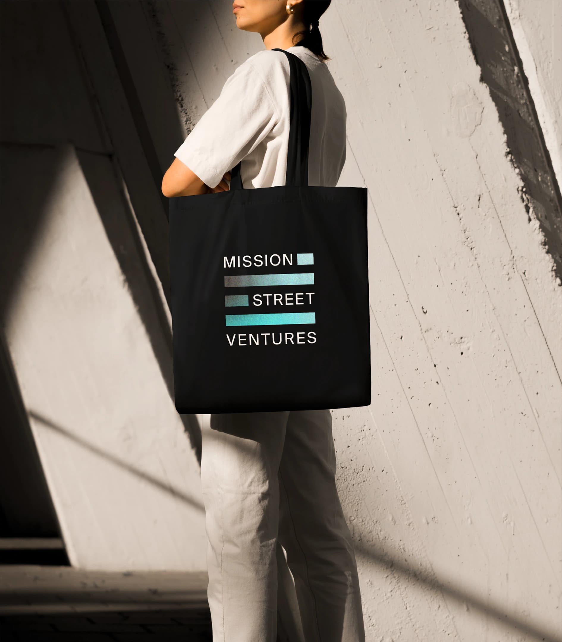
The logo has no single fixed form.
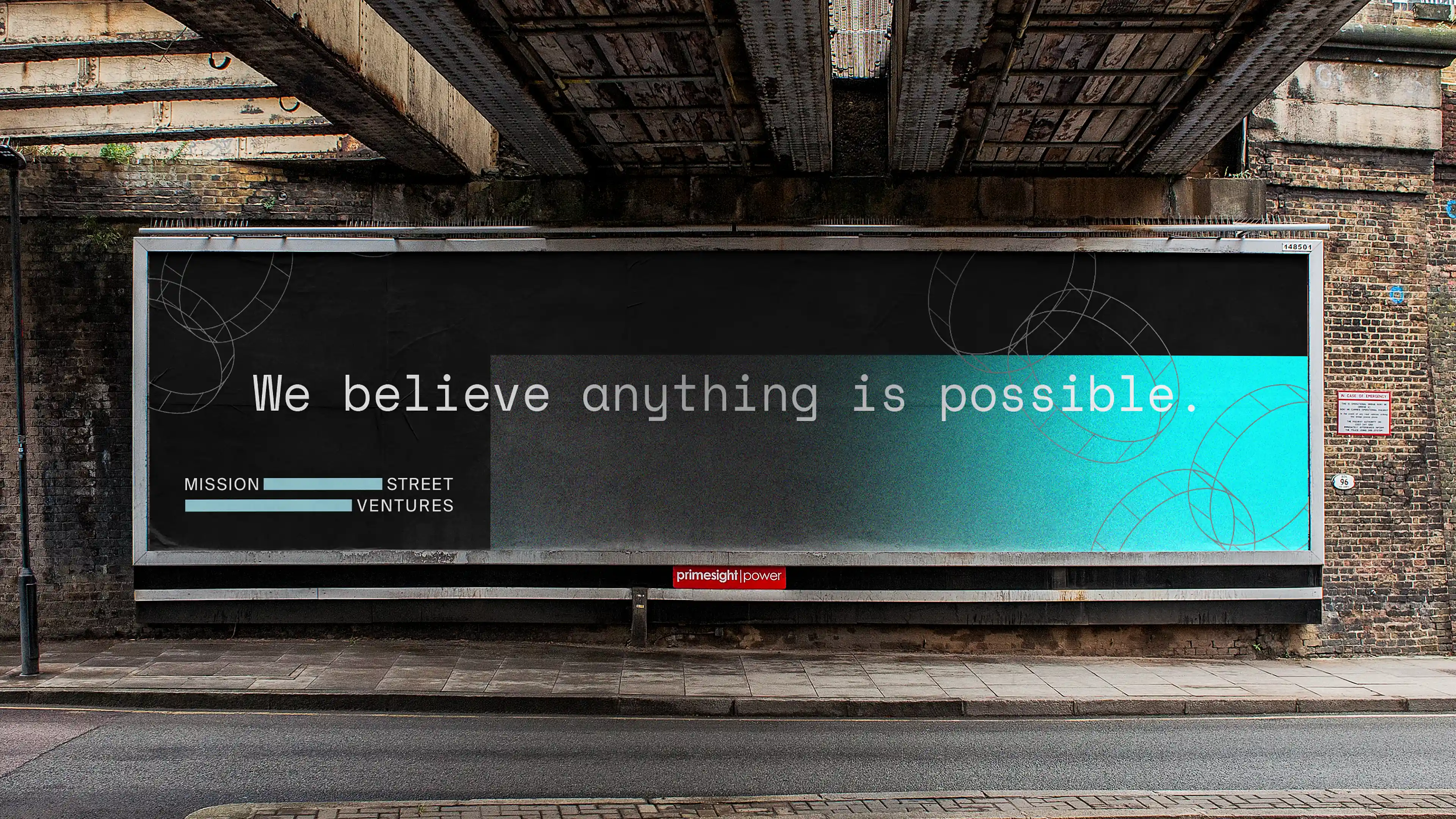
We built a fully responsive identity – a mark that reconfigures across contexts rather than being scaled and placed. It behaves differently depending on where it appears, which means no single execution ever becomes the definitive one. For a fund that takes different forms for different engagements, the identity does the same thing structurally rather than saying it in a strapline.
That decision also solved the anti-brand problem. A mark that will not sit still cannot be reduced to a logo on a pitch deck. It stays slightly out of reach, which is precisely where MSV wanted to be.
Interface
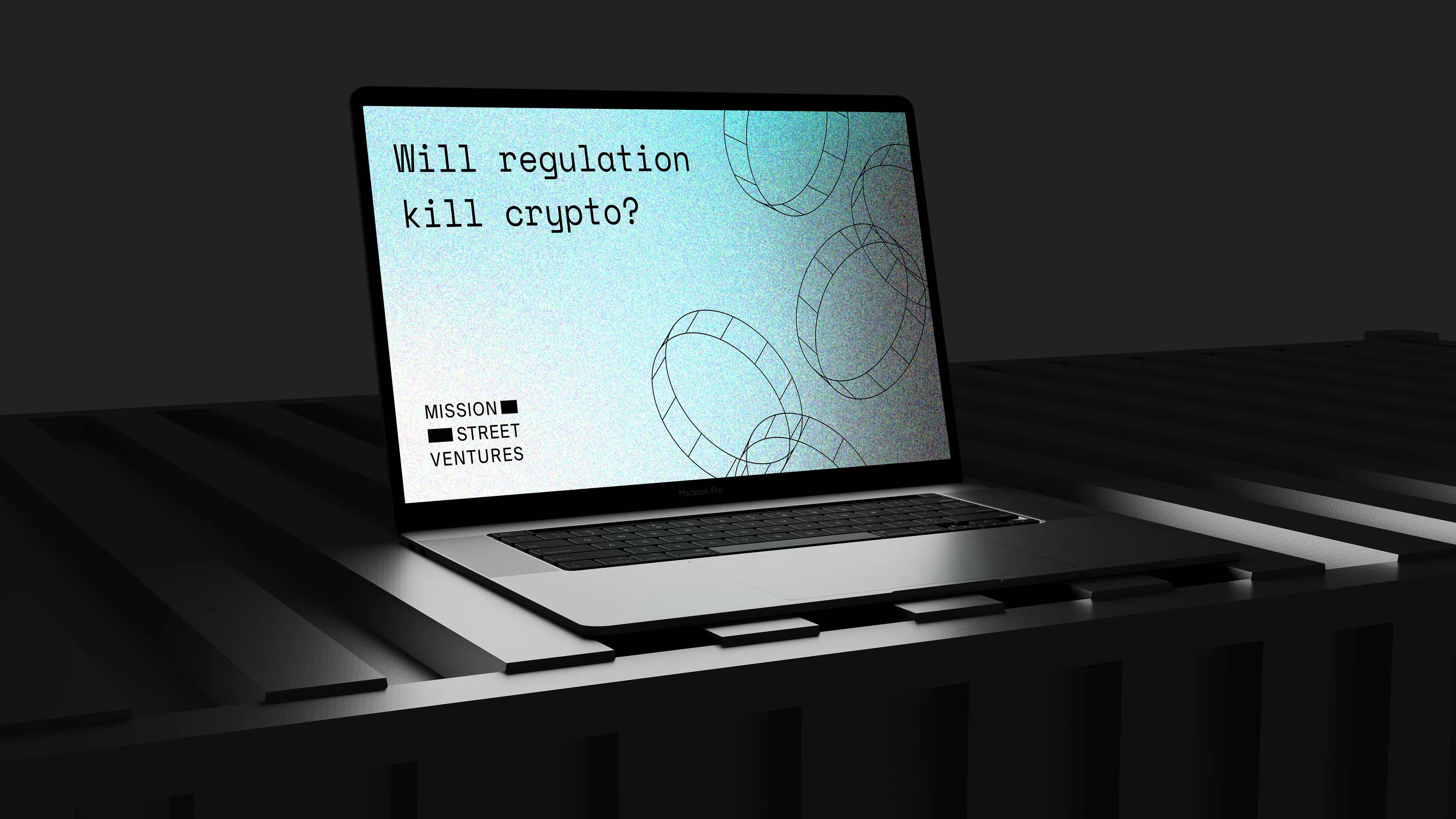
The website was built as a terminal window.
There is no navigation in the conventional sense. To reach the portfolio, you type. Visitors have to engage with the site on its own terms – a command line, not a brochure – and the ones who do are self-selecting into exactly the audience MSV wanted: technical, curious, unbothered by friction.
It is the most complete expression of the brief. The site does not persuade you. It waits.
Why this matters
Most brands are built to be seen. This one was built to be found, and only by people prepared to look.
Restraint as a position is one of the hardest things to execute, because every conventional instinct in branding pulls toward clarity, reassurance and reach. Holding the opposite line – and building a system rigorous enough to sustain it across every surface – takes more discipline than a loud brand does, not less.
The confidence to say less remains the rarest move in this work.
More
FTA
The UAE talent agency branded from conception and live in eight weeks – six-figure revenue in year one, and Diamond at the Transform Awards.
Oxley
An approvals tool for senior finance professionals, built and incubated by Blue Rocket – brand and product, live and still running.
Companio
The leading foreign-owned connector to Estonia’s e-Residency scheme – a new name taken to a working brand and a live product surface.