Brand strategy, identity and a live site. Six weeks, start to finish.
Overview
What we did
Brand Strategy
Brand Platform
Visual Identity
Verbal Identity
Web Design
Web Build
mindably was a B2B platform for revenue teams, pairing mental wellbeing support with specialised sales coaching. It was built on a straightforward observation: the pressure that drives sales performance is also what burns it out.
Founder Sanjiv arrived with a vision on paper and nothing else. No name recognition, no positioning, no visual language, no way to explain the idea to a buyer. He needed all of it, and he needed it before the funding runway made the question academic.
Six weeks later he had a strategic platform, a full visual and verbal identity, and a live website. This is the Launch programme running at its intended pace.
Six weeks. Brand strategy sessions to live website.

Position
We opened with brand strategy sessions rather than design, because the hard part was not what mindably looked like. It was what mindably was arguing.
Businesses invest heavily in sales tooling and neglect the human element that powers it. Revenue professionals sit under sustained pressure; the result is burnout, turnover and lost revenue. mindably’s answer – putting therapists and specialised sales coaches directly in front of teams – sat awkwardly between two categories that neither wellbeing platforms nor sales enablement tools were addressing.
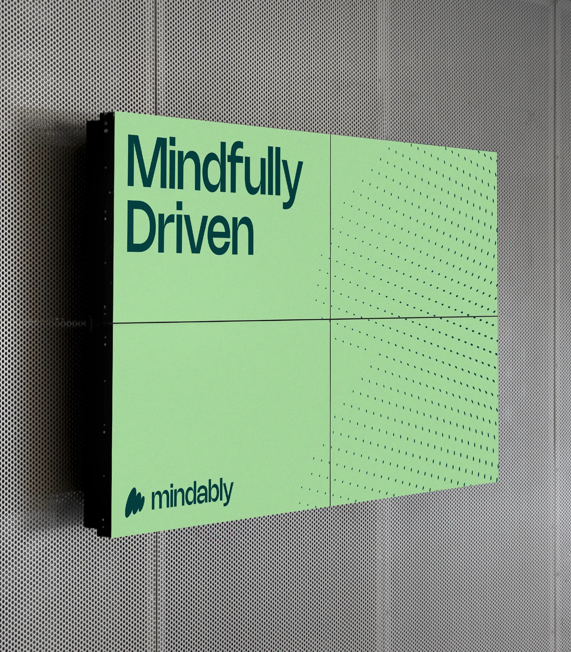
The sessions landed on a purpose that resolved the tension rather than splitting the difference: Mindfully Driven – balancing wellness and success for revenue teams. Not wellbeing at the expense of performance. Wellbeing as the mechanism of it.
That single idea carried every decision that followed.
Identity
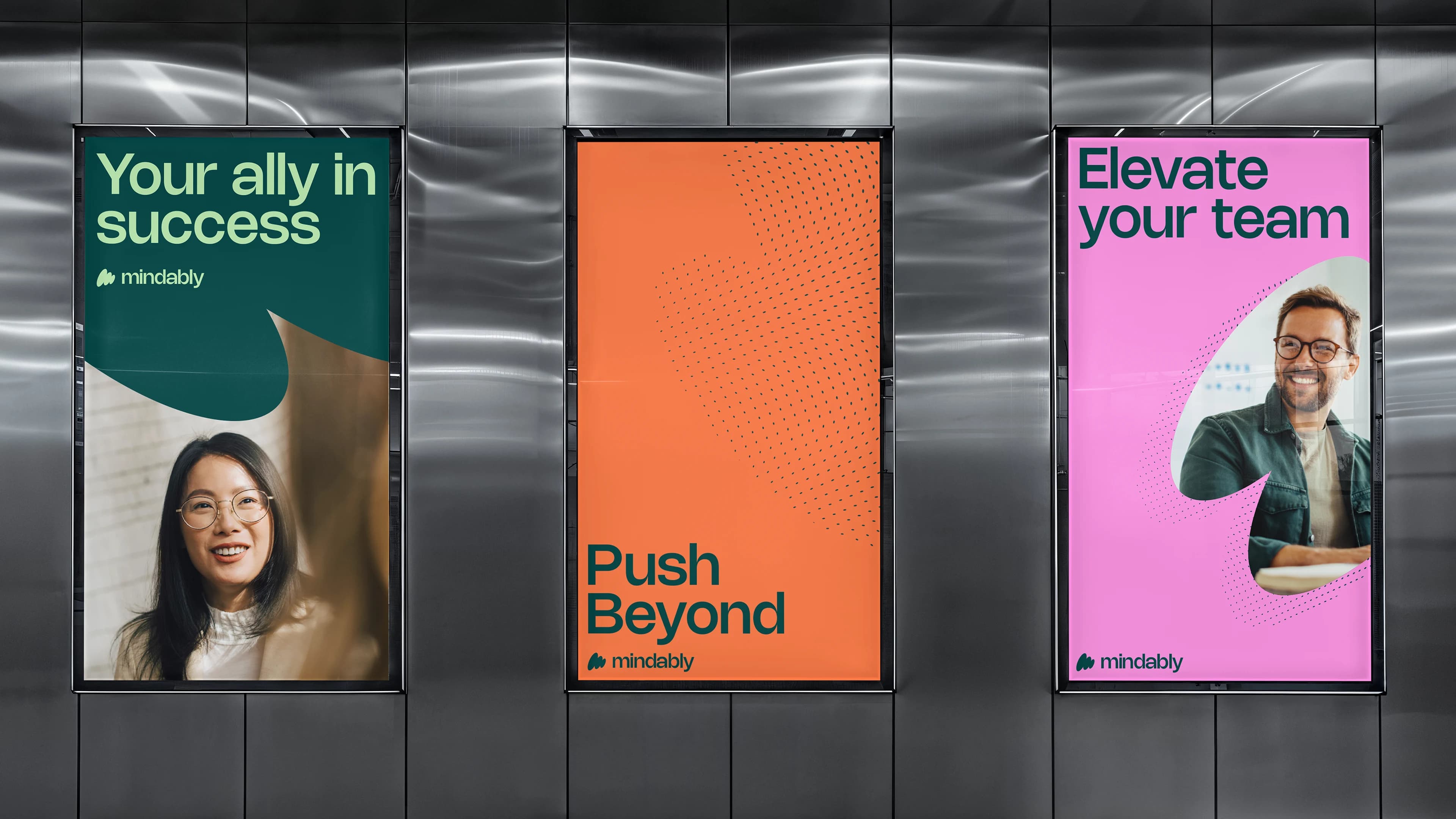
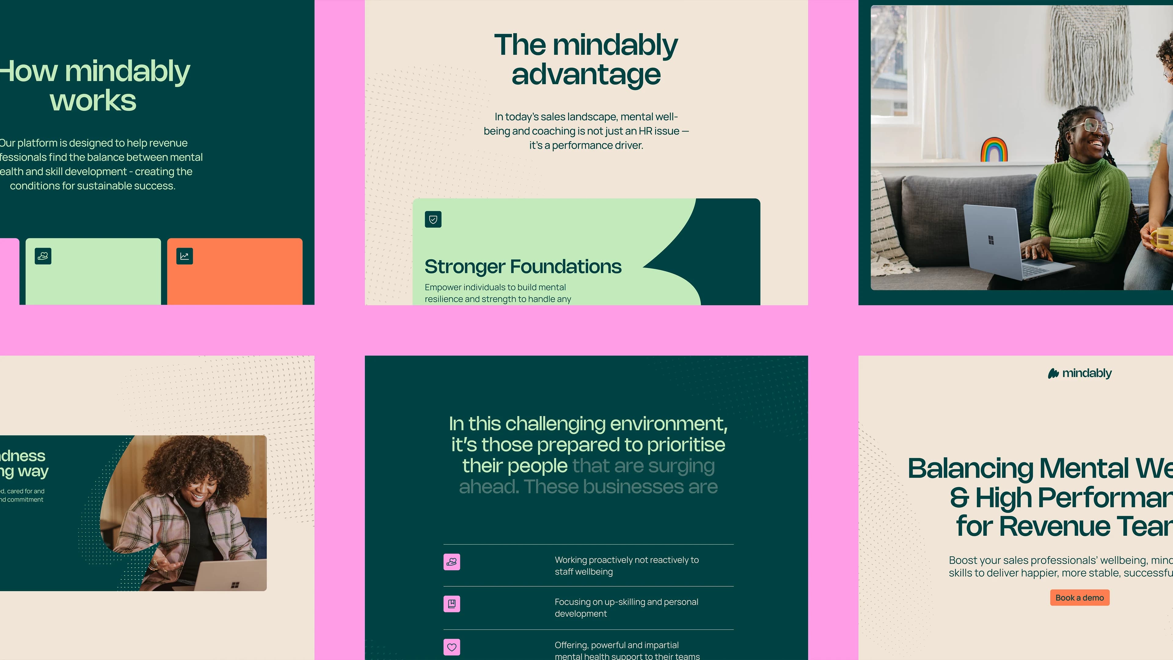
The identity had to hold two registers at once. Warm enough that a sales director would trust it with a conversation about burnout. Credible enough that the same person would put it in front of a CFO.
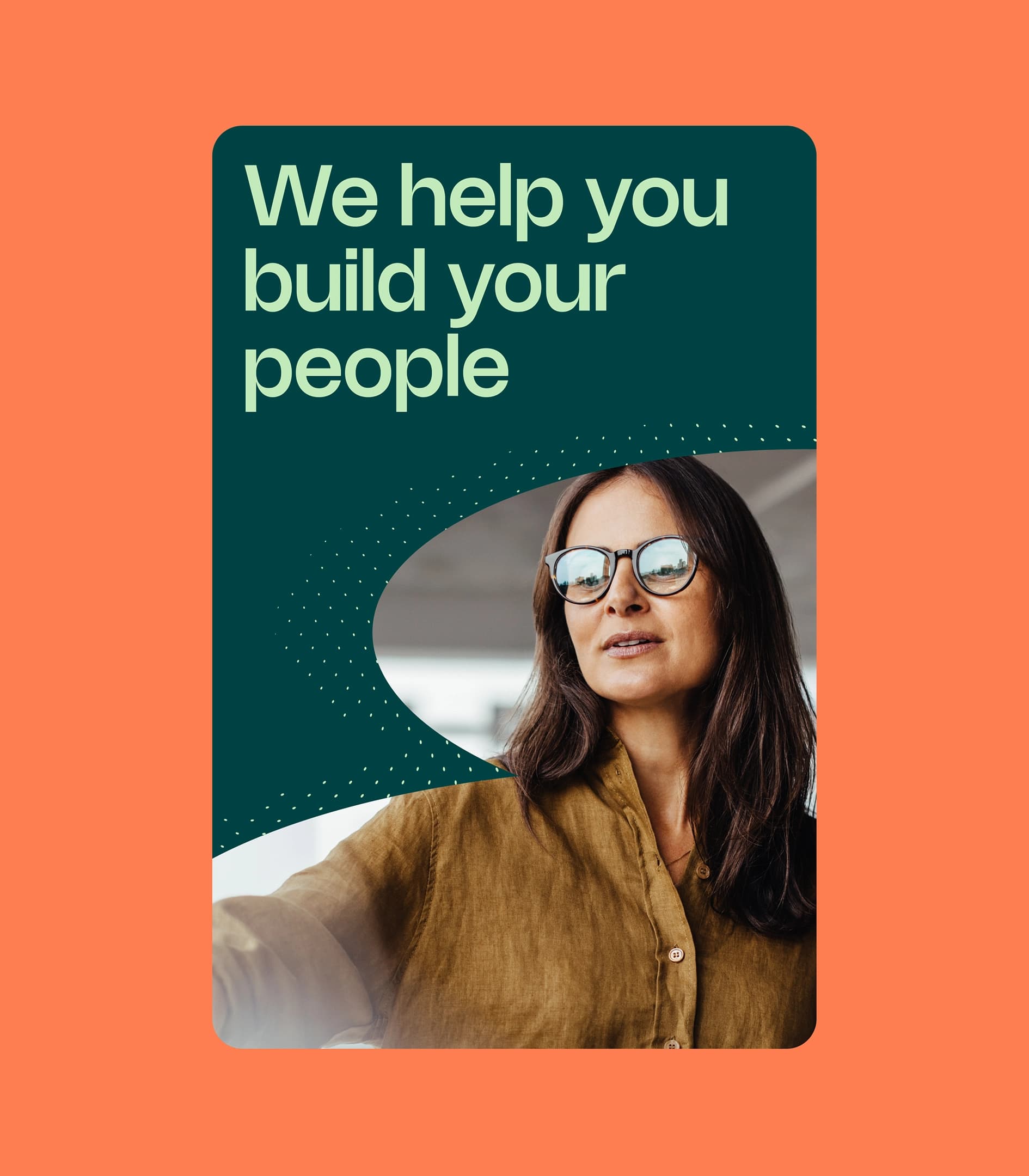
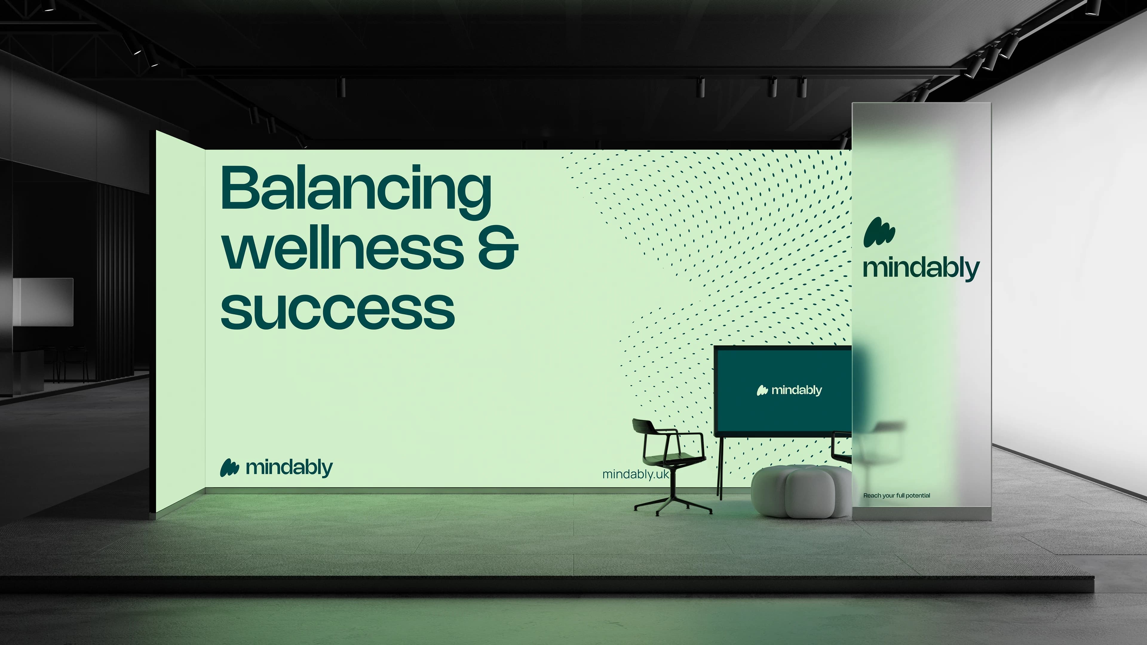
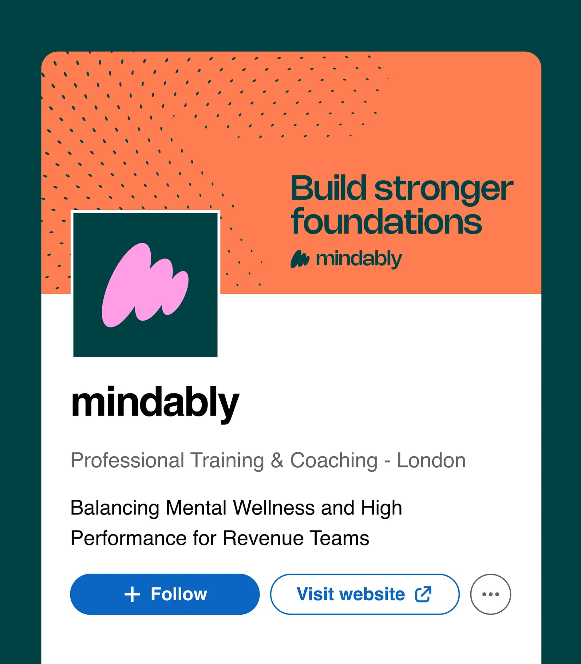
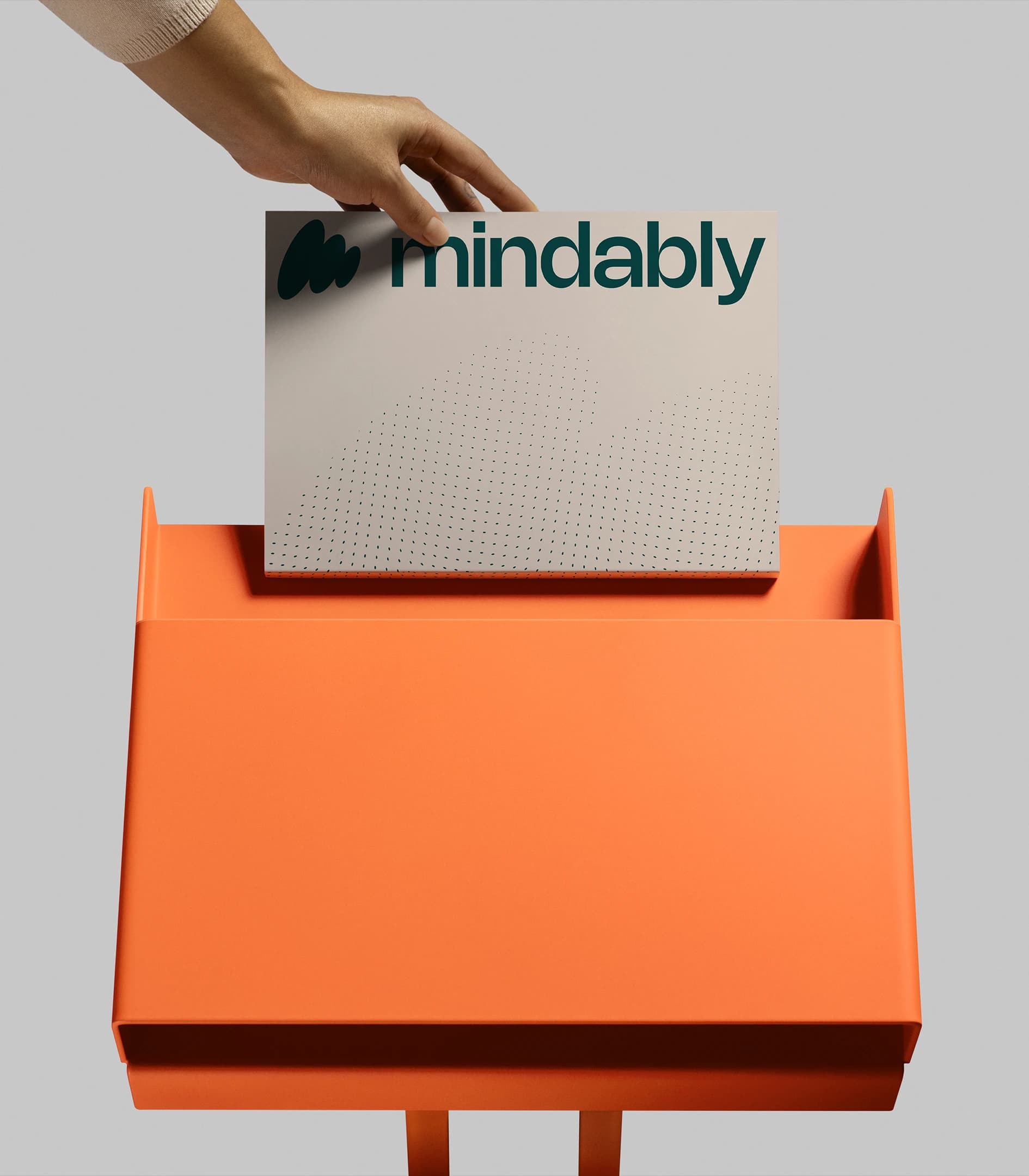
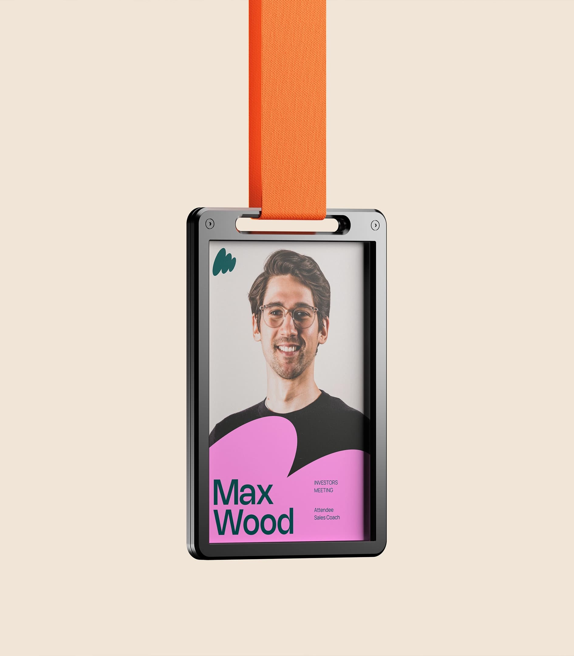
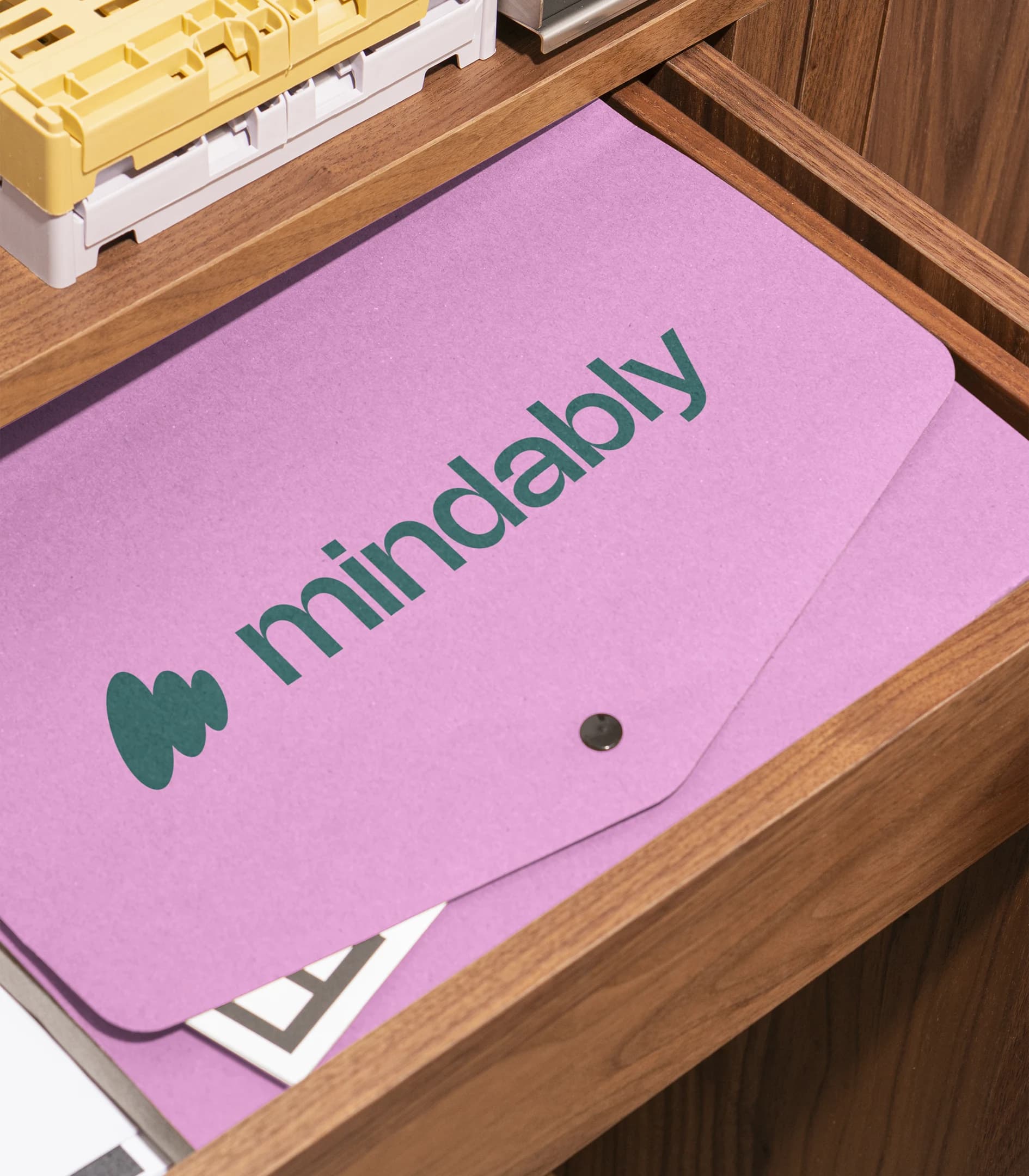
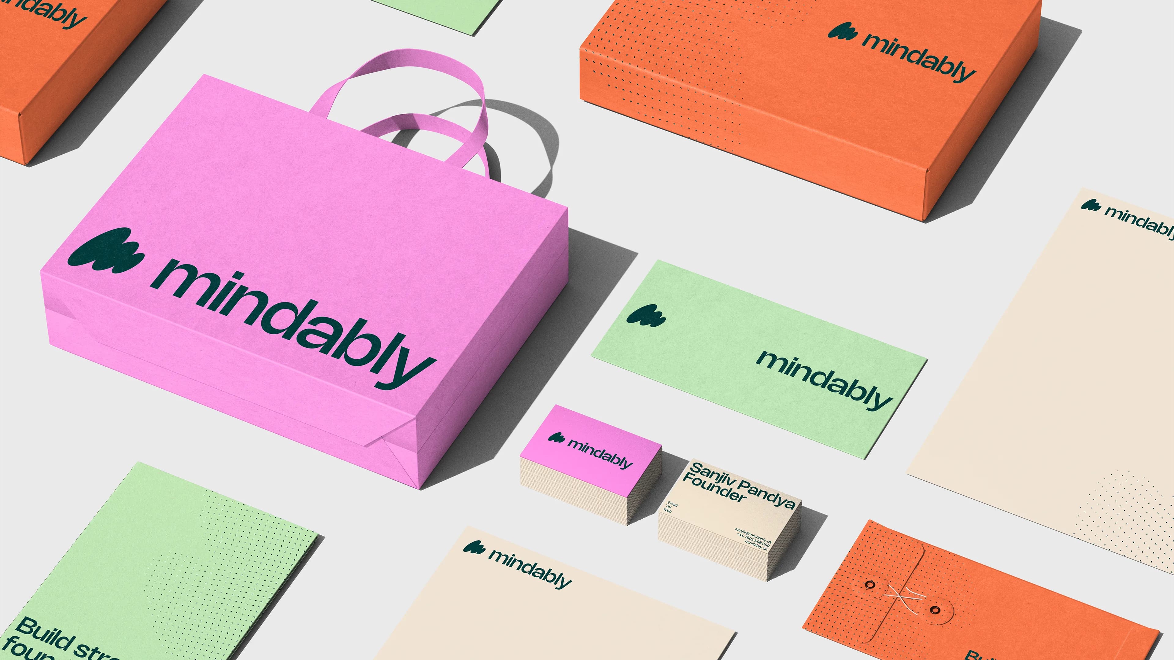
A deep, rich green anchors the palette – stability and growth – lifted by lighter tones that keep it approachable rather than clinical. The custom mark reads as forward movement and mindful reflection in a single gesture, which is the whole proposition compressed into one shape. Nohemi Medium carries personality through headlines; Manrope keeps body copy clear and unfussy. A pattern system drawn from the mark adds depth across surfaces without competing with the content it sits behind.
The verbal identity did the same work in language: direct about performance, unembarrassed about mental health, and never softening one to protect the other.
Build
With the platform and identity set, we designed and built the site in Webflow.
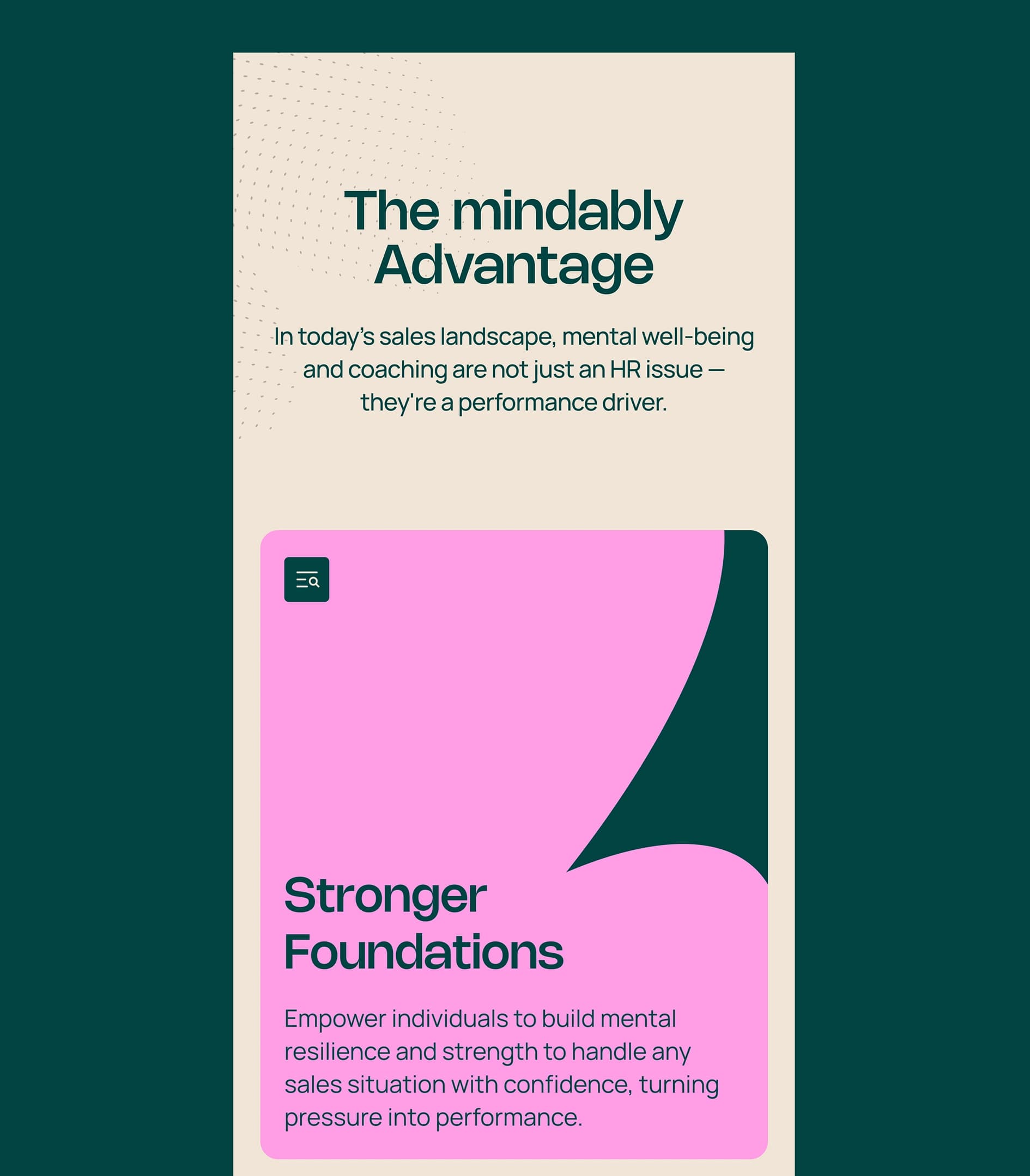
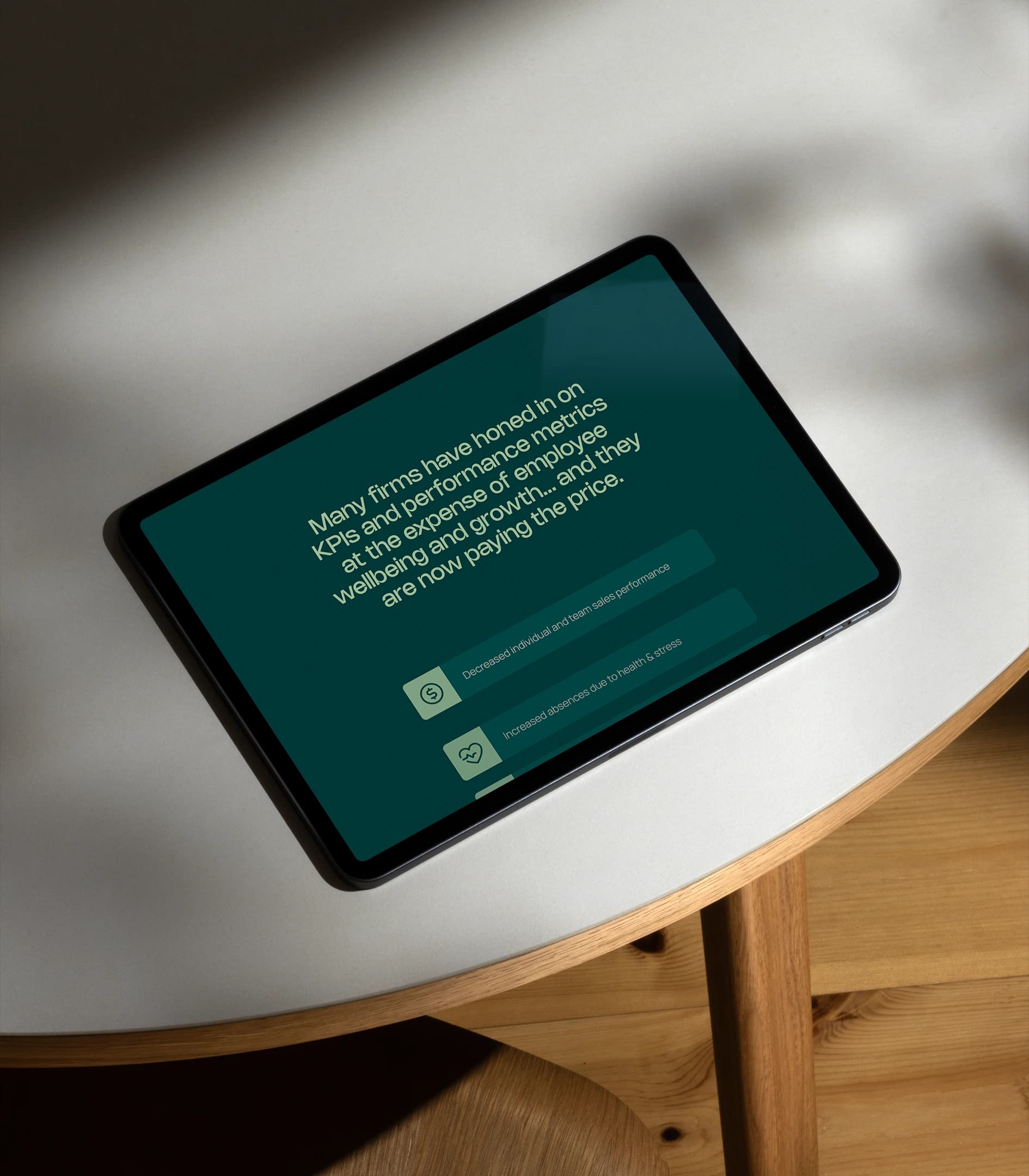
The job was to make one argument land in a single scroll: wellbeing and performance complement each other rather than compete. The structure speaks to business leaders in their own terms – pressure, retention, revenue – while keeping the human centre of the offer visible throughout. Sanjiv worked alongside us for the full six weeks, which is what made the pace possible.
Why this matters
Launch exists because early-stage founders do not need a year of brand theory. They need the foundations right, the argument clear, and the door open.
The discovery work is precisely what makes six weeks achievable. Speed here is the output of clarity, not a substitute for it – and the sequence matters more than the calendar. Strategy first, always, even when the calendar is the constraint.
More
FTA
The UAE talent agency branded from conception and live in eight weeks – six-figure revenue in year one, and Diamond at the Transform Awards.
Oxley
An approvals tool for senior finance professionals, built and incubated by Blue Rocket – brand and product, live and still running.
Companio
The leading foreign-owned connector to Estonia’s e-Residency scheme – a new name taken to a working brand and a live product surface.